

Overview of Common Stains
Full overview of the most common stains, including how to identify them and treat them
Your ads should grab attention, build trust, and drive clicks - but too often, simple mistakes lead to wasted budgets and low results. Contractors frequently fall into these pitfalls, which hurt engagement and increase costs. Here’s a quick rundown of the most common errors and how to avoid them:
These mistakes can waste up to 50% of your ad budget. Fixing them can boost conversion rates from 5–8% to 15–25%, saving money and generating more leads.
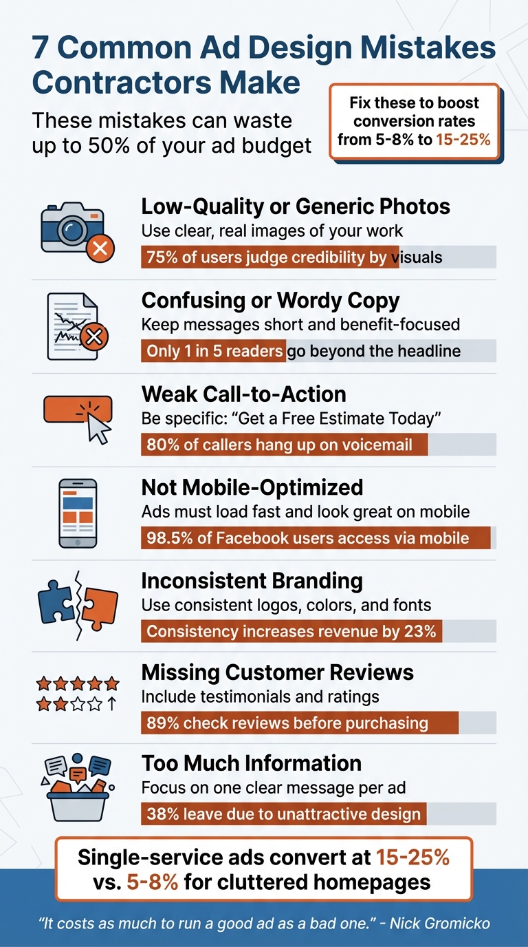
7 Common Ad Design Mistakes Contractors Make and How to Fix Them
The quality of your photos says a lot about your work. Blurry, pixelated, or poorly lit images can send the wrong message to potential clients. As JH Specialty puts it, "In the eyes of the viewer, the quality of the photo can translate to the quality of the product or service you provide". This problem is made worse by ad platforms compressing images - often to under 100kb - so starting with a low-resolution image only amplifies the issue. Poor visuals not only create a bad first impression but also damage trust.
Trust goes beyond appearances. Pugo Design Studio points out that using low-quality visuals suggests your business may lack the resources or care to present itself professionally, which can hurt your credibility. Considering that 75% of users evaluate a brand’s credibility based on its website design, visuals play a huge role in whether someone decides to contact you.
Authenticity matters just as much as quality. Generic stock photos can come across as impersonal and inauthentic. Peter Lewis, CEO of Service Allies, explains: "High quality graphics or professional photos aren't necessarily what's going to get people to buy. It's about getting them to stop scrolling with an authentic photo, so that they actually read your ad and see the value". Real photos - like your crew in uniform, job sites, or before-and-after transformations - perform better on social media because they show you’re a real home service contractor with real experience.
To avoid these common pitfalls, focus on capturing authentic, high-quality images. Even smartphone photos can work if done thoughtfully. Take pictures of your team in action, and leave enough space around the subject to fit different ad formats. Avoid stretching small images to fill larger spaces, as this leads to pixelation. Before-and-after shots are especially effective at showcasing your work.
Finally, remember the technical details. Use descriptive file names and alt text to improve ad visibility. When taking photos, stick to natural light and avoid shooting directly into windows, which can create dark, unusable images. These small steps can make a big difference in how potential customers perceive your business.
Clear and concise ad copy is crucial if you want to increase your click-through rate (CTR). A low CTR tells Google your ad isn’t hitting the mark, which can hurt your Quality Score and drive up your cost per click.
Avoid overused buzzwords like "innovative solutions" or "synergize" - these phrases often come across as meaningless and are easy for users to ignore. Instead, get straight to the point. Use short, straightforward sentences in plain language, and skip filler words that dilute your message.
Here’s a trick: apply the "So What?" test. For every feature you mention, ask yourself, "So what?" until you uncover the real benefit to your audience. For example, saying you have a 24-hour crew doesn’t mean much on its own. But framing it as "back up before the next shift" speaks directly to a customer’s need. Once you’ve nailed the benefit, highlight it right away using the Inverted Pyramid style. Why? Because only 1 in 5 readers will go beyond the headline.
Once your message is clear, the next step is ensuring it’s visually easy to digest.
Even the most well-crafted message needs a reader-friendly layout to grab attention. Structure your copy for quick scanning - use bullet points, short paragraphs, and plenty of white space. Keep headlines under 10 words so they display fully on mobile devices, and use bold fonts or high-contrast designs to make your text stand out. For display ads, keep text to less than 20% of the image area.
Focus on one specific audience and their problem instead of trying to appeal to everyone. Broad, generic messaging rarely resonates. In fact, tweaking just a few lines of ad text can increase CTR by nearly 90%. Investing time to make your message clear and targeted can pay off in a big way.
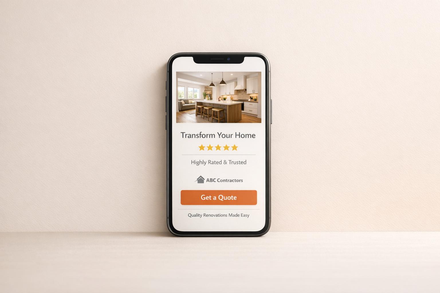
A generic "Contact Us" button just doesn't cut it. Homeowners need to know exactly what they'll gain when they click. Instead of vague phrases, try something more specific and enticing, like "Get a Free Estimate Today," "Call Now for a Free Inspection," or "Schedule Your Consultation." These options clearly communicate value and encourage action.
Your call-to-action (CTA) also needs to match the urgency of the search. For example, if someone clicks on an "Emergency Plumber" ad, they don’t want to read about your company’s history - they want immediate help. Matt Sitek, Founder of Rivet, explains:
"The person who clicked your 'Emergency Plumber' ad doesn't care about your HVAC services or your company history... They need to see 'Emergency Plumbing Service' and a phone number in under 3 seconds".
For emergency services, use high-impact CTAs like "Get Help Now" instead of softer options like "Learn More."
Adding urgency and incentives can also encourage immediate action. Time-sensitive phrases like "Call before storm season arrives" or financial perks such as "Financing available" or "Limited-Time Discounts" can make hesitant homeowners take the leap. Keep in mind, 80% of callers who reach a voicemail will hang up and call a competitor. Your CTA needs to create a sense of NOW.
On mobile - where 60–70% of searches happen - ensure your phone number is a tap-to-call link. Position it above the fold, and use bold, contrasting colors like bright orange or green to grab attention.
Finally, don't let the engagement stop after the initial action. Follow up with a secondary CTA on your Thank You page. For example, after a lead form submission, offer a link to book a specific call time or watch a company video. This keeps prospects engaged and helps build trust while they’re still interested.
And remember, optimizing your ad design for mobile devices is key to making all of this work seamlessly.
Here's a staggering fact: 98.5% of Facebook users access the platform on mobile devices. If your ads aren't optimized for mobile, you're missing out on a massive chunk of potential engagement. Ryan Goering, Founder of BaaDigi, highlights this perfectly:
"With 98.5% of Facebook users accessing the platform via mobile devices and fewer than 5% using mobile web browsers, mobile optimization isn't optional - it's essential."
Mobile-first strategies aren't just a nice-to-have - they're a necessity. For example, vertical video ads can reduce conversion costs by 12.3%. Plus, consider this: a whopping 93% of Facebook's $135 billion ad revenue comes from mobile ads. These numbers make it clear - designing with mobile users in mind is a critical part of any successful campaign.
To make your ads stand out on mobile, you need to fine-tune every detail. Start with the 9:16 vertical aspect ratio for video ads, ensuring they fill the entire screen. Text overlays should be at least 24pt for easy readability, and don’t forget captions - most users scroll with their sound off.
Interactive elements should be thumb-friendly. That means buttons and links need to be at least 44px wide. If you're including phone numbers, enable tap-to-call functionality. And don't overlook your landing pages - they should load in under 3 seconds.
Simplify mobile forms wherever possible. Stick to just three fields - Name, Phone, and Service - because every additional field can hurt your conversion rates. Finally, always test your ads on an actual mobile device. This ensures your design looks and functions as intended on smaller screens. As Matt Sitek warns, failing to meet these mobile standards can lead to significant traffic loss.
Consistent branding is just as important as mobile optimization or eye-catching visuals. It builds trust and reinforces your identity in the minds of your audience.
When logos, colors, and fonts vary across platforms, it creates confusion and weakens brand recognition. And that’s a big deal - 90% of potential customers expect a consistent experience across all marketing channels. Imagine seeing a Facebook ad with one color scheme, only to land on a page with completely different visuals. Instead of building trust, it might leave people second-guessing your credibility.
Consistency doesn’t just feel good; it delivers results. It can increase revenue by 23% and shows up 34% more often in top-performing ads [58,60]. Take Tropicana’s 2009 packaging redesign as a cautionary tale - when they replaced their iconic "orange with a straw" image, sales plummeted by 20%. Familiarity and recognition are powerful.
"Inconsistency doesn't shout. It whispers." - Daan van der Wiele, Co-Founder, alpha.one
To tighten up your branding, start with a visual audit. Review your ads, social media profiles, and website to ensure they align in terms of buttons, fonts, and color schemes [57,58]. Next, create a centralized folder for approved assets like logos, templates, and fonts to prevent outdated or incorrect materials from slipping through.
Document your hex codes and stick to 2–3 brand fonts to avoid a fragmented look [59,61]. It’s worth the effort - 46% of consumers are willing to pay more for a brand they trust. And trust starts with presenting a cohesive, polished image.
Including customer reviews isn't just a nice touch - it’s essential for building trust and driving conversions. Skipping this step can cost you credibility and sales, especially since 89% of consumers check online reviews before making a purchase decision. For construction contractors, this is even more critical. Homeowners aren’t just hiring a service; they’re letting someone into their home and trusting them with a major investment.
Reviews act as third-party endorsements, offering unbiased validation of your work. As Aaron Hockel, VP of Digital Marketing at AltaVista Strategic Partners, explains:
"Online reviews have taken the concept of word-of-mouth and amplified it on a global scale."
The numbers back this up: positive reviews can increase customer spending by up to 31% and boost overall sales by an average of 18%.
The most impactful testimonials address real concerns homeowners often have - like budget overruns, poor communication, messy worksites, or contractors disappearing after payment. Specific details make all the difference. For instance, a review that mentions how your team handled unexpected structural issues or completed a project on time and within budget carries far more weight than vague praise. As Wolf Gutscher, Director of Operations and Sustainability at Larkspur-Corte Madera School District, shared:
"I have become fond of calling Alten the 'Seal Team 6' of construction and would recommend them without qualification."
To maximize the impact of reviews in your ads, pair them with before-and-after photos of completed projects. Use concise, attention-grabbing quotes instead of long paragraphs, and include visual trust signals like star ratings directly in your ad creative. Google, for example, begins displaying yellow star ratings once you gather five or more reviews. Reaching 10 or more reviews can increase your search traffic by 15–20%.
Finally, timing is key. Ask for reviews as soon as a project wraps up by sending a direct link to make the process easy for your clients.
When someone stumbles upon your ad, they’re not dissecting every word - they’re skimming. If your message isn’t clear within 5–7 seconds, they’re moving on. The mistake many contractors make is trying to cram everything - services, company history, certifications - into a single ad. This overload creates decision fatigue, making it easier for potential customers to click away and explore competitors instead.
"Don't try to cram too much information into your ad copy; keep it short, sweet, to the point - and most of all - pleasurable to read, watch, or listen to." - Ryan Chute, Founder of Wizard of Ads
Your ad should focus on the essentials: what you offer, how much it costs, and how to get started.
A concise message is just the start. A clean, well-organized layout is equally important. Overcrowded ads with little to no white space are hard to read and visually unappealing. Here’s the reality: 38% of visitors will leave because of unattractive design, and 42% will bounce due to poor functionality caused by clutter. Ads and landing pages that focus on one specific service convert at 15–25%, compared to just 5–8% when traffic is directed to cluttered homepages.
Stick to the 20/80 rule: no more than 20% of your ad space should be text, leaving 80% for impactful visuals. Short paragraphs, bullet points, and high-quality images create a natural flow that guides users from the headline to a clear call-to-action. Intentional white space keeps the ad looking clean and inviting.
Mobile users demand simplicity. Cluttered ads with oversized images not only look bad but also slow down load times. And here’s the kicker: users start abandoning sites after just 3 seconds of load time. Sites that load in 1 second can see 3x more conversions than those taking 5 seconds.
To optimize for mobile, ensure buttons are at least 48x48 pixels, avoid intrusive pop-ups, and keep the focus on a single service per ad. A streamlined design improves usability and keeps potential customers engaged.
Fixing these seven common ad mistakes can turn a struggling campaign into a revenue-generating machine. As mentioned earlier, every element of your ad design plays a role in its success. Using poor-quality images, overloading your ad with information, or ignoring mobile users can result in wasting 30–50% of your budget on errors that are entirely avoidable. But by focusing on the essentials - high-quality visuals, concise messaging, compelling calls-to-action (CTAs), and a mobile-first approach - you can boost conversion rates from 5–8% to an impressive 15–25%.
"It costs as much to run a good ad as a bad one." - Nick Gromicko, Contractors Association
It's crucial to keep in mind that most Facebook users access the platform on mobile devices. Additionally, leads contacted within the first five minutes are far more likely to convert. This means your ads need to perform flawlessly across all devices, deliver a clear and engaging message, and encourage immediate action.
Ad campaigns aren’t something you can set up and forget about. Over time, performance naturally declines as competitors adjust their strategies and audiences grow tired of seeing the same creative. Regularly reviewing and updating your ads is key to avoiding wasted spend and staying competitive. Refreshing your creative every 7–10 days and monitoring search terms weekly helps maintain profitability and keeps your campaigns running efficiently.
Estatehub’s Growth and Premium plans take care of all the heavy lifting, offering everything from mobile-optimized visuals and conversion tracking to continuous campaign adjustments and CRM integration. The Premium plan goes a step further with unlimited campaign tweaks and multi-source lead generation, ensuring your ads remain effective and your leads keep flowing. When your ads are thoughtfully designed and consistently managed, you’re not just spending money - you’re building a reliable system to drive revenue.
When it comes to contractor ads, the right photos can make all the difference. The most effective images include staged shots that provide context and tell a story about your work. Here are some examples:
For the best results, use natural light whenever possible and make sure the sites are clean and well-organized. This creates a polished, professional look that builds confidence in your services.
To craft a more effective call-to-action (CTA), focus on making it specific, compelling, and action-oriented. Generic phrases like "Submit" or "Contact Me" are easy to overlook. Instead, use engaging language that speaks directly to your audience's goals, such as "Find Your Dream Home Today" or "Explore Homes Under $500K." Emphasize the value they’ll receive and address their needs upfront. Adding a sense of urgency or immediacy - like "Limited Time Offer" or "Don’t Miss Out" - can also encourage quicker responses and boost conversions.
To make your ads more effective for mobile users, focus on designing with small screens in mind. Use clear, concise messaging, large, easy-to-read fonts, and visuals that display well on mobile devices. Make sure your landing pages are optimized for mobile, with fast load times and straightforward navigation.
It's also important to test your ads on various devices regularly. This helps you fine-tune details like text size, button placement, and image quality, ensuring a smoother user experience that can lead to higher conversions.
Sign up for the newsletter and be the first to read our articles.


Every single person on our agency team has spent a lot of time in the field either running their own business or working for larger marketing agencies. We have all put in the time responding to leads, helping customers, scheduling and doing services. This gives us a massive advantage when making decisions.
One thing that has always been very special to us, is the fact that (excluding spam / people that never used our services) we do not have any bad reviews. This absolutely does not mean we have never had unhappy clients, but if it happens, we make it right, and stand behind our promises.
We have seen, time and time again, other agencies using strategies and structuring campaigns the way that they are technically supposed to. Most of these "best practices" that are taught in our industry, simply do not transfer into local lead gen. This is partially because we do have a much different target audience, and are typically spending less, however optimizing for website traffic does not work here.
We have been there, jumping into starting a home service business, struggling, and doing everything wrong. It's humbling. Our team has all felt the highs and lows, which is why we get so excited for our clients to win, we know how good it feels.

Estatehub is not a normal agency, we know "clicks" don't get you sales. Let us show you how lead gen experts do it.

