


Overview of Common Stains
Full overview of the most common stains, including how to identify them and treat them
Your website’s Call-to-Action (CTA) buttons are the key to turning visitors into customers. Here are the most important takeaways to optimize your CTAs for higher conversions:
Pro tip: Track performance using tools like heatmaps and session recordings to see how users interact with your CTAs. Even small tweaks can lead to big improvements in click-through rates and conversions.
Let’s dive into the details of designing, writing, and testing CTAs that deliver results.

CTA Button Optimization Statistics and Best Practices
CTA design isn't just about aesthetics - it directly impacts clicks and conversions. A well-crafted button can boost sales by over 35%. On the other hand, a poorly designed one fades into the background, unnoticed. Let’s break down the key visual elements that make a CTA stand out.
Contrast is key. Your button must pop against the page background; otherwise, visitors might miss it. In fact, 39% of consumers say color is the most important visual element on a website.
Color psychology also plays a role. Here’s a quick rundown of what different colors can convey:
However, the "right" color depends on your design. For example, HubSpot tested a green button versus a red one. Despite green’s association with "go", the red button drove 21% more clicks because it contrasted better with the rest of the page, which featured green tones. The lesson? Your button color should stand out from its surroundings.
To maximize visibility, use complementary colors (those opposite each other on the color wheel) and surround your button with white space.
Size and shape are just as important as color. Google advises that buttons should be at least 48px wide and tall for optimal usability, while accessibility guidelines recommend a minimum of 44px. Smaller buttons can frustrate mobile users who may struggle to tap them accurately.
That said, bigger isn’t always better. Oversized buttons can overwhelm the design and hurt conversions. The trick is to make your primary CTA larger than secondary buttons, creating a clear visual hierarchy without overpowering the page.
Shape matters too. Rounded corners make buttons feel approachable and inviting, while sharp edges give off a more energetic vibe. A good rule of thumb is to set the corner radius to about 30% of the button’s height.
For padding, aim for horizontal spacing that’s about 50% of the button’s height - this keeps the text from looking cramped. If you’re placing multiple buttons close together (like "Get Quote" and "Learn More"), leave at least 8px of space between them to avoid accidental taps. Adding a forward-facing arrow to your button text can also boost performance; one test showed this simple tweak improved results by 12.29%.
When it comes to fonts, simplicity wins. Use bold serif or sans-serif fonts for easy readability. Skip overly decorative typography - clarity should always come first.
Your CTA text should stand out. Make it larger than your body copy, but closer in size to your H1 or H2 headings. A bold or heavy font weight ensures it grabs attention. Just as important, the text color must contrast sharply with the button background. Use a WCAG contrast checker to ensure readability for all visitors, including those with visual impairments.
Center-align your text within the button and leave enough padding to give it breathing room. If you’re using a text link instead of a button, adjust the underline so it doesn’t cut through descenders (the lower parts of letters like 'g' and 'y'). Keep your CTA text short and to the point - just a few words work best to reduce cognitive load and increase impact.
Your button might look sleek, but the right CTA (call-to-action) text is what truly drives conversions. Let’s break down how to write button copy that gets results.
Action verbs are your best friend when crafting CTA text. They not only guide users but also emphasize the benefits they’ll receive. For example, words like "Get", "Claim," or "Discover" focus on the value offered. On the flip side, verbs like "Order", "Submit," or "Buy" tend to highlight the effort or cost involved.
"The treatment copy conveys value. 'Order' emphasizes what you have to do – not what you're going to receive. Whereas 'Get' emphasizes what you're going to receive." - Michael Aagaard, CRO Expert
Another effective strategy is using a first-person perspective. Subtle shifts, like replacing "your" with "my", can make a big impact. For instance, changing "Start your free 30-day trial" to "Start my free trial" increased click-through rates by 90%. Similarly, Shira Siegel from SaferVPN noted a 10% rise in leads when the company used phrases like "Get yours now" or "Secure your internet".
Specificity also matters. When Michael Aagaard tested the phrase "Get membership" against "Find gym and get membership" for a Scandinavian gym chain, the latter saw a 68% boost in conversions. Clearer, more specific language eases user anxiety and clarifies the next step.
Now, let’s look at how urgency and exclusivity can amplify your CTA.
Urgency is a powerful motivator. Words like "now", "today," or "immediately" push users to act without delay. Time-sensitive phrases, such as "Offer ends at midnight" or "Limited collection," tap into FOMO (fear of missing out), nudging users toward quicker decisions.
"The most important element of a call to action is immediacy. This action you want them to take - it is not something to be done tomorrow or next week, it is something to be done now." - William Gadea, Founder and Creative Director, Idea Rocket Animation
But urgency isn’t just about commanding action - it’s about highlighting benefits. Instead of saying "Sign up now," try "Get 50% off today only." This approach shifts the focus to what users gain by acting quickly. Adding limited-time language can increase conversions by as much as 332%.
Exclusivity plays a similar role. Phrases like "Claim my spot" or "Send me my kit" make offers feel personal, as though they’re reserved just for the user. Pairing urgency with reassurance - like a nearby note saying "Cancel anytime" - can further reduce hesitation.
Once you’ve nailed the tone and word choice, brevity is the final touch. Keep your CTA to four words or fewer to make it easy to scan and act on. Long-winded text increases cognitive load, making users less likely to click.
Focus on value instead of the process. For example, instead of saying "Get started," try "Plan your finances" to show how the action will benefit them. This shift transforms a generic "call to action" into a clear "call to value."
Here’s a great example: In January 2024, PriceCharting, a US-based company tracking video game prices, changed its CTA from "Download" to "Price Guide." That simple, value-focused tweak led to a staggering 620.9% increase in click-through rates. Including the word "free" in CTAs - like "Start my free trial" - is another proven way to reduce friction and boost conversions.
Once your design and copy are in tip-top shape, the next step is figuring out where to place your CTAs so users will actually notice - and click - on them. The key isn’t just about making your site look good; it’s about understanding how visitors naturally navigate your pages.
The "above the fold" section - everything visible before a user starts scrolling - is some of the most valuable space on your website. Why? Because 90% of visitors who read your hero banner also take the time to check out the accompanying CTA copy. This makes it a prime spot for capturing attention, especially from visitors who are ready to act right away.
That said, this placement works best for straightforward offers like free trials or demos. If your service or product requires more explanation, placing the CTA below the fold might work better, as it gives users time to absorb the details first. Wherever you place it, visual cues can help guide users’ eyes to the right spot.
Most people scan web pages in predictable patterns - either a Z shape or an F shape, starting at the top-left and moving toward the bottom-right. That bottom-right area is naturally where the eyes land after scanning, making it a great spot for your main CTA.
To make it even easier for users to focus on your button, use design elements like arrows, lines, or images pointing toward the CTA. Surrounding the button with plenty of whitespace also helps it stand out from the rest of the page. A quick trick? Step back and squint at your page - if the CTA still pops out, you’re on the right track. Once you’ve grabbed their attention, the next step is placing CTAs where users are most likely to make decisions.
The best CTAs appear right when users are ready to take action. Think about moments when trust and interest are highest - like right after a testimonial, case study, pricing breakdown, or list of benefits. These are the golden opportunities to nudge users toward converting.
For longer pages, such as blog posts or service descriptions, having multiple CTAs can be a smart move. Place one at the top for those ready to act quickly, another mid-page after key details, and a final one at the bottom for readers who’ve taken in all the information. One company even saw a 71% boost in downloads after ditching their sidebar and focusing on inline CTAs instead. And don’t forget sticky or floating CTAs - these stay visible as users scroll, keeping the action button within easy reach.
Here’s a quick breakdown of where to place CTAs based on content type and user behavior:
| CTA Location | Best For | User Intent Level |
|---|---|---|
| Above the Fold | Simple offers, free trials, demos | High / Immediate |
| Mid-Page | Feature breakdowns, benefit stacks | Moderate / Exploring |
| End-of-Page | Long-form content, pricing, FAQs | High / Informed |
| Sticky/Floating | Long-scroll pages | Continuous |
| Inline | Blog posts, educational content | Low to Moderate |
Testing is the secret sauce for refining CTAs and discovering what truly resonates with your audience. Even small adjustments can lead to massive gains. For example, one company saw a 90% jump in click-through rate just by changing "Start your trial" to "Start my trial". Below, we’ll break down how to test and improve your CTAs effectively.
A/B testing is the go-to method for fine-tuning CTAs. The golden rule? Test one element at a time. This way, when your click-through rate increases, you’ll know exactly what caused the improvement.
For instance, you could test:
Start with a clear hypothesis. Instead of randomly experimenting with colors, try something like: "Switching the button from blue to orange will increase clicks because it stands out more against the background." Then, focus on high-traffic pages like your homepage or pricing section to get results faster. Aim for a 95% confidence level (p < 0.05) to ensure your findings are statistically reliable.
Here’s an example: A European e-commerce site increased sales by 35.81% by tweaking its CTA color and shape.
"Avoid testing multiple variables at the same time. Keep it simple so success is easier to trace."
– Carly Stec, Team Manager for Blog and Academy Acquisition, HubSpot
Key elements to prioritize in your tests include:
Run each test for at least one to two weeks. Drawing conclusions too early can lead to misleading results.
Tracking user behavior goes beyond just measuring click-through rates. Tools like heatmaps and session recordings offer deeper insights.
Here’s a quick breakdown of key metrics:
| Metric | What It Measures | Why It Matters |
|---|---|---|
| Click-Through Rate (CTR) | % of users who clicked vs. total views | Shows if your CTA stands out and if the message is compelling. |
| Conversion Rate | % of users completing the desired action after clicking | Indicates alignment between your CTA and the landing page. |
| Bounce Rate Post-Click | % of users leaving immediately after clicking | Highlights if the landing page fails to deliver on the CTA’s promise. |
| Scroll Depth | How far users scroll down the page | Helps determine if your CTA is in a visible location. |
Use these metrics to identify weak spots and guide your next round of adjustments.
The data you gather from testing should directly inform your next steps. Focus on small, incremental changes. While only 20–30% of tests yield clear winners, those small wins can collectively boost conversions by about 49%.
"Don't be afraid to start testing incremental changes. Minor tweaks to language, visual characteristics, and placement wind up making for the most effective CTAs."
– AJ Beltis, Marketing Manager for Content and Acquisition, HubSpot
Consistency is key. Even if a test doesn’t yield dramatic results, it still provides valuable insights. And remember, user behavior isn’t static. Traffic sources, audience preferences, and design trends evolve over time. A winning CTA today might not perform as well tomorrow. Keep testing, tweaking, and treating CTA optimization as an ongoing process.
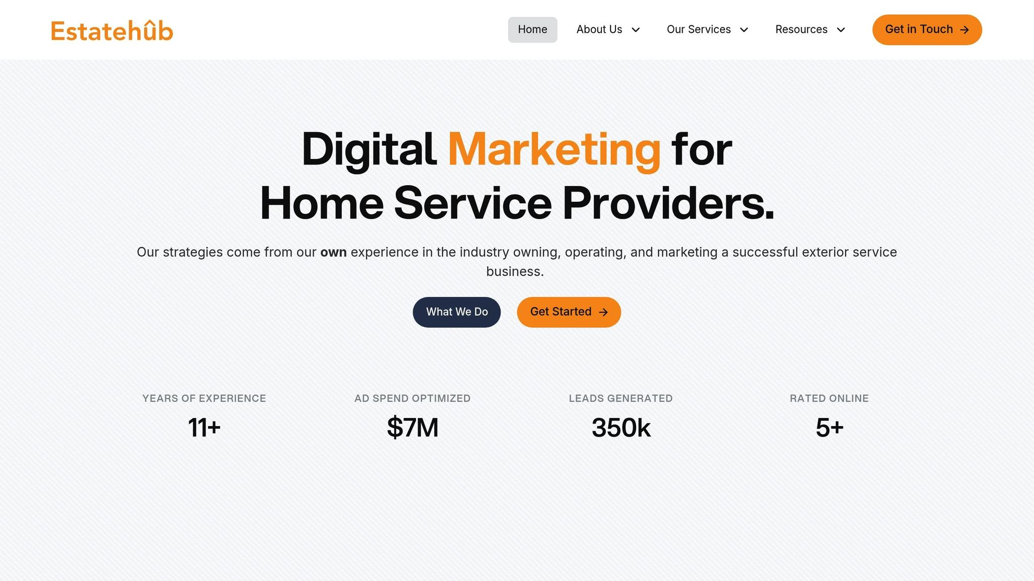
Estatehub takes proven strategies for designing and writing CTAs (calls-to-action) and adapts them specifically for home service providers like HVAC contractors, plumbers, and electricians. A strong CTA can turn casual website visitors into qualified leads, but many small business websites miss this opportunity by overlooking effective CTAs. Estatehub’s digital marketing services focus on creating CTAs that deliver results, helping businesses turn clicks into revenue.
Here’s how Estatehub improves CTA performance for home service providers.
Estatehub’s web development team creates CTA buttons that not only reflect your brand but also grab attention. They use high-contrast colors - like orange, red, or green - that stand out against your site’s background. To keep the design cohesive, they often pick a "third color" from your brand palette specifically for CTAs, ensuring these elements pop without clashing with the overall look of your website.
But it doesn’t stop at color. Estatehub uses custom CSS to add details like unique fonts, 3D effects, and borders, making buttons feel interactive and inviting. With data showing that 90% of visitors who read the hero banner also notice the CTA copy, Estatehub places CTAs in high-traffic areas like the hero section for maximum impact.
Estatehub crafts CTAs designed to generate measurable results. They use action-oriented language, incorporating verbs like "Discover" or "Find" and first-person phrases such as "Claim My Spot" to make the call feel personal. Adding urgency with words like "Now" or "Today", and including terms like "Free", helps reduce hesitation and encourages users to take action.
"Using phrases like 'get yours now' or 'secure your internet' has helped us to garner an increase of 10% in leads."
– Shira Siegel, Inbound Marketing Manager, SaferVPN
Strategic placement also plays a critical role. Estatehub ensures CTAs are visible in high-traffic areas and optimized for both desktop and mobile users. To further build trust, they add microcopy - small text like "No credit card required" or "Cancel anytime" - that reassures visitors and removes barriers to clicking.
Estatehub uses HighLevel CRM tools to track clicks, attribute leads, and conduct A/B tests on CTA elements. This integration connects each CTA to specific marketing campaigns, providing insights into what’s working. Tracking methods, like redirect URLs or browser-based asynchronous tracking, ensure accuracy without disrupting user experience.
With these tools, Estatehub can implement "Smart Content", which shows tailored CTAs based on the viewer’s status - such as one version for new visitors and another for returning leads. This segmentation ensures the right message is delivered to the right audience. By analyzing user interactions and making data-driven adjustments, Estatehub has helped home service providers achieve up to a 30% boost in conversion rates with small but impactful changes.
Refining CTA buttons is a continuous process that combines design, copy, placement, and testing to achieve better results. The best-performing CTAs often feature high-contrast colors, action-driven language, and strategic placement to direct visitors toward taking action. Interestingly, only 20–30% of A/B tests reveal a statistically significant winner, which means you’ll likely need to test multiple versions to discover the one that truly connects with your audience.
"Clear beats clever. Obvious beats hidden. A button that looks like a button almost always outperforms whatever avant-garde idea someone sketches on a whiteboard."
– Peter Lowe, Crazy Egg
Data from testing highlights how impactful even small adjustments can be. For example, changing the wording from "Start your free trial" to "Start my free trial" has been shown to increase click-through rates by 90% and boost conversions by an average of 49%. Other adjustments, like resizing buttons, tweaking microcopy, or repositioning a CTA, can also lead to noticeable revenue growth.
For home service providers, optimizing CTAs is especially important. Many smaller websites in this industry fail to include a clear call-to-action, leaving potential revenue untapped. This gap highlights the importance of expert solutions tailored to the needs of home service businesses. Estatehub specializes in turning underperforming CTAs into powerful revenue drivers with proven design, implementation, and tracking strategies.
Estatehub offers customized, results-focused CTA solutions for home service providers. From initial design and placement to CRM tracking and A/B testing, Estatehub equips businesses to convert website visitors into qualified leads. With the right strategy and consistent optimization, your CTAs can become a key driver of growth and success.
Choosing the color for your CTA button is about finding the sweet spot between psychology and visibility. Colors aren’t just visual - they stir emotions and can nudge people to act. For instance, red often sparks urgency, green suggests trust, and blue conveys reliability. The trick is selecting a color that not only fits your brand but also encourages the action you’re aiming for.
But there’s another crucial factor: your button needs to pop. A high-contrast color that stands out against the background makes it easier for users to spot and click. Want to know what works best? Try A/B testing different colors to discover which one grabs your audience’s attention and boosts engagement.
To improve the performance of your CTA buttons, start by conducting A/B tests on different elements. Experiment with variables like button color, text, size, and placement. Test one element at a time to pinpoint which changes have the biggest impact.
Establish specific success metrics to measure your results. These could include click-through rates (CTR), conversion rates, or even revenue generated. Regularly review the data and adjust your strategy based on what you learn.
Lastly, make sure your CTAs match your audience's preferences and behaviors. Frequent testing and fine-tuning can lead to noticeable gains in engagement and conversions.
CTA button placement is critical for improving conversion rates because it shapes how users engage with your website or landing page. When positioned thoughtfully, CTAs can guide users effortlessly toward actions like signing up or making a purchase, removing any unnecessary friction along the way.
Placing CTAs where they align with user intent - such as above the fold, near key decision points, or following engaging content - ensures they stand out and feel relevant. This smooth experience increases the likelihood that visitors will follow through, driving more conversions.
Sign up for the newsletter and be the first to read our articles.


Every single person on our agency team has spent a lot of time in the field either running their own business or working for larger marketing agencies. We have all put in the time responding to leads, helping customers, scheduling and doing services. This gives us a massive advantage when making decisions.
One thing that has always been very special to us, is the fact that (excluding spam / people that never used our services) we do not have any bad reviews. This absolutely does not mean we have never had unhappy clients, but if it happens, we make it right, and stand behind our promises.
We have seen, time and time again, other agencies using strategies and structuring campaigns the way that they are technically supposed to. Most of these "best practices" that are taught in our industry, simply do not transfer into local lead gen. This is partially because we do have a much different target audience, and are typically spending less, however optimizing for website traffic does not work here.
We have been there, jumping into starting a home service business, struggling, and doing everything wrong. It's humbling. Our team has all felt the highs and lows, which is why we get so excited for our clients to win, we know how good it feels.

Estatehub is not a normal agency, we know "clicks" don't get you sales. Let us show you how lead gen experts do it.

