

Overview of Common Stains
Full overview of the most common stains, including how to identify them and treat them
Struggling to convert mobile visitors into leads? You're not alone. Mobile users make up over 60% of local searches for home services, but their conversion rates (1.8%) lag far behind desktop users (3.9%). The good news? Small, focused changes can double your mobile leads without spending more on ads.
Here’s what you need to know:

Mobile CRO Statistics for Home Service Providers: Conversion Rates and Impact Data
A mobile-responsive website adapts seamlessly to any screen size - whether it's being viewed on a smartphone, tablet, or desktop. This isn't just about aesthetics; it's about ensuring functionality when homeowners need your services the most. Imagine someone searching for "emergency plumber near me" on their phone. If your site isn’t easy to navigate, they’ll quickly hit the back button and choose a competitor instead.
Here’s why it matters: 63% of all Google searches for home services are made on mobile devices, and 88% of those searches lead to a call or visit within 24 hours. A mobile-responsive design bridges the gap between mobile and desktop users, improving both user experience and conversion rates.
A responsive design removes the hurdles that can drive potential customers away. Say goodbye to horizontal scrolling, tiny fonts, and buttons that are impossible to tap. Did you know that 72% of customers judge a business's credibility based on its website design, and they form that opinion in just 50 milliseconds?
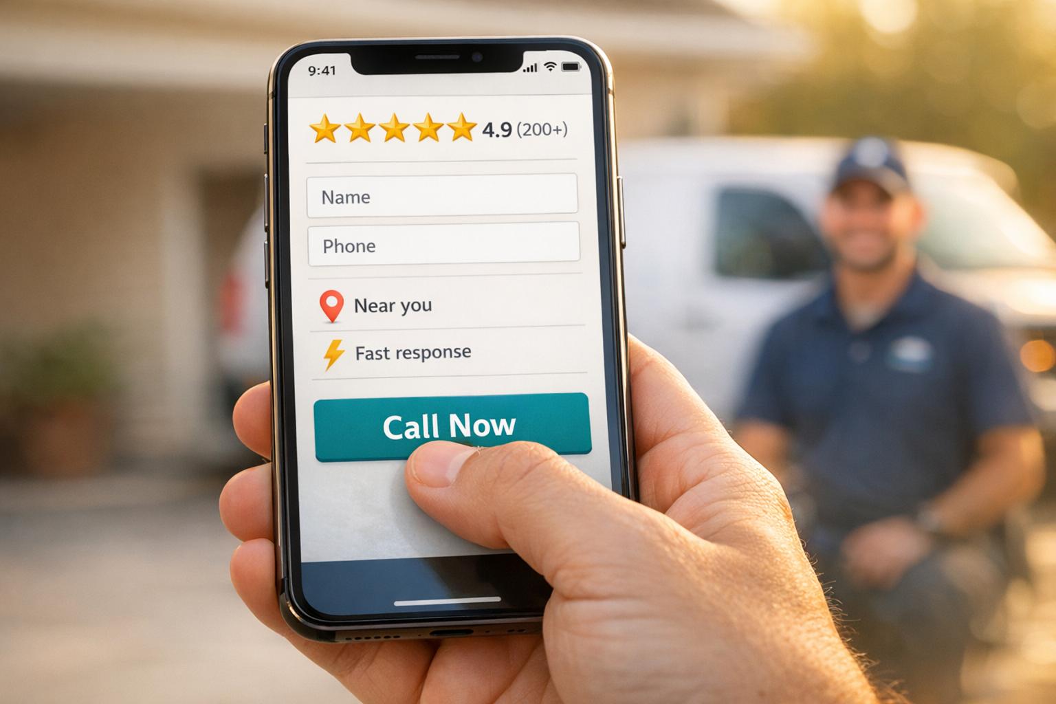
To create a user-friendly experience, think about how people use their phones. Most navigate with one hand, using their thumb to scroll and tap. Place critical elements - like "Call Now" buttons and service menus - in the lower half of the screen, where thumbs naturally rest. And make sure all tap targets are at least 44x44 pixels , so users don’t miss their mark.
A mobile-responsive site doesn’t just resize - it prioritizes what mobile users need most. Use scannable content with short paragraphs (2-4 sentences), clear headings, and bullet points . Add click-to-call buttons with tel: links, allowing customers to call you with a single tap . For forms, set input types to type="tel" for phone numbers and type="email" for emails to make the mobile keyboard more intuitive .
Speed is just as crucial as design. Compress images to under 200 KB and use modern formats like WebP to keep load times under 2.5 seconds . As Charwin Vanryck deGroot from BKND Development puts it:
Your website has one job. Get the phone to ring.
If your site takes too long to load, you risk losing over half of your mobile visitors. Every second of delay could mean a missed opportunity to connect with a potential lead.
Nearly half of all consumers - 47% to be exact - expect a webpage to load in 2 seconds or less. When your site loads quickly, it sends a message of reliability, which is especially important for homeowners dealing with urgent issues. On the flip side, a slow site can make your business seem outdated and untrustworthy, leaving visitors with a poor first impression.
The connection between site speed and conversions is undeniable. A delay of just 1 second in load time can slash conversion rates by 7%. And with every additional second, conversion rates drop by about 4.42%.
Take the example of Sarah Martinez from Martinez Climate Control. In 2025, she reduced her website's load time from 8 seconds to just 2.1 seconds by using techniques like image compression, caching, and performance-focused hosting. The results were striking: a 45% increase in form submissions and a 67% rise in phone calls directly from the site.
"After optimizing our HVAC website's loading speed from 8 seconds to 2.1 seconds, we saw a 45% increase in form submissions and a 67% increase in phone calls from the website. The ROI was immediate." This level of performance is a hallmark of guaranteed lead generation programs designed for contractors. - Sarah Martinez, Founder, Martinez Climate Control
This example shows how improving page speed not only drives conversions but also strengthens overall lead generation marketing efforts.
Fast-loading websites perform 2.5x better at converting visitors into leads compared to slower ones. This is crucial in today’s mobile-driven world, where 60% of local searches come from mobile devices. To meet Google's performance standards, focus on Core Web Vitals:
To achieve these benchmarks, tools like Google PageSpeed Insights can help identify problem areas. From there, you can take steps like compressing images into WebP format (which is 25–35% smaller than JPEGs), enabling browser caching, and using a Content Delivery Network (CDN) to ensure content is delivered from servers closest to your visitors. These optimizations can make a noticeable difference in both user experience and business results.
When it comes to mobile design, placing buttons where thumbs naturally rest is essential for boosting conversions. Homeowners often use their phones one-handed in emergencies, so button placement can make or break the user experience.
Did you know that 49% of people use their phones with one hand, and 73% of local home service searches happen on mobile devices? . This means your potential customers could be juggling multiple tasks while urgently searching for help. That’s why the "Green Zone" - the bottom center of the screen - is prime real estate for thumb-friendly buttons.
If essential buttons like "Call Now" or "Request Service" are placed outside this zone, users are forced into awkward gestures, which can lead to frustration. This friction may increase bounce rates by up to 20%. Worse, 61% of users will leave a poorly navigated mobile site, and 40% will go straight to a competitor.
To avoid these pitfalls, design your buttons to be at least 60 pixels wide with 12 pixels of surrounding space. This reduces the chance of mis-taps and aligns perfectly with mobile optimization goals, improving the overall user experience and keeping visitors engaged .
Thumb-friendly design isn’t just about convenience - it directly impacts conversions. Mobile-first websites for contractors see conversion rates 35–50% higher than those that simply adapt desktop designs for mobile. In fact, adopting a "thumb-first" layout can increase conversion rates by as much as 25%.
Sticky click-to-call buttons, strategically placed in the thumb zone and always visible while scrolling, deliver impressive results. Contractors who use these buttons report a 40–60% jump in phone leads. This is crucial, considering phone calls for home services convert at rates of 30–50%, compared to just 1–2% for contact forms. With 89% of emergency home service searches happening on mobile, having an easily accessible call button ensures you capture high-intent leads when it matters most.
When emergencies strike, customers don’t have the time - or patience - for a confusing menu. A cluttered navigation system can push potential clients away. In fact, 61% of users will leave a mobile site with poor navigation, and 40% will immediately head to a competitor.
Your mobile menu should act like a guide, quickly leading users to the service they need. First impressions matter - users form an opinion about your website in as little as 50 milliseconds. That’s why clarity is non-negotiable. With 80% of users relying on the main navigation, it’s smart to limit your mobile menu to 5–7 essential items, keeping it simple and user-friendly.
"Your website navigation isn't just a collection of links – it's your digital front door, your virtual dispatcher." - Cube Creative
Use labels that make sense to your audience. For example, instead of technical terms like "Hydro Jetting", go for problem-solving language like "Clogged Drain". Action-oriented labels such as "Schedule Service" or "24/7 Emergency Repair" are much more effective than generic ones. To keep things tidy, consider using a hamburger menu (the familiar three-line icon) for secondary links.
An easy-to-navigate menu doesn’t just make users happy - it also leads to measurable improvements in conversions.
A well-designed menu can directly impact your bottom line. Every extra menu item adds friction, decreasing your conversion rate by about 0.5% per item. This is especially critical for mobile users, where 73% of home service searches and 89% of emergency searches happen on smartphones. Companies that prioritize clean navigation typically see an 18% increase in service bookings.
Sticky navigation - where elements like your menu or a "Call Now" button stay visible as users scroll - can make a big difference. It ensures that key actions are always within reach. Additionally, designing buttons and links to be at least 44x44 pixels helps prevent accidental taps, reducing frustration. Since mobile users spend 57% of their time in the top half of a webpage, keeping navigation streamlined and accessible is crucial for capturing leads before they slip away.
Click-to-call buttons are a game-changer for turning mobile users into immediate leads. Imagine a homeowner dealing with a burst pipe in the middle of the night or a broken AC during a scorching summer day - they’re not going to fill out a contact form. They need help now. These buttons let users connect with your business in one tap, skipping the hassle of dialing numbers manually.
When paired with a simple menu design, click-to-call buttons make it easy for customers to reach you when every second counts.
Phone calls are far more effective at converting leads than contact forms. Adding click-to-call functionality can increase mobile conversion rates by up to 200%. In fact, 88% of mobile users searching for local businesses either call or visit within 24 hours. And since over 60% of home service searches happen on mobile devices, having an easy-to-spot call button is a must.
Good placement of click-to-call buttons does more than just generate leads - it keeps users engaged. For example, placing the button above the fold can increase interaction by 304%. Using a sticky header or floating button ensures the call option stays visible as users scroll, making it easier for them to take action. To avoid accidental taps, make sure the button is at least 48×48 pixels, which can improve click-through rates by 90%.
For a seamless experience, use the tel: HTML protocol (e.g., <a href="tel:+1234567890">) so the phone’s dialer opens instantly. Choose colors that align with the service you’re offering - red or orange for emergencies to create urgency, or blue for non-urgent services to build trust. Instead of generic text like "Contact Us", opt for action-driven phrases such as "Call Emergency Service Now" or "Fix Your AC Today" . Also, include your business hours near the button so customers know when live support is available .
Streamlined navigation and quick call options are vital for mobile users, but trimming down form fields is just as important. Imagine a homeowner dealing with a flooded basement or a broken furnace - they’re not going to waste time filling out a lengthy form on their phone. Every extra field increases the chance they’ll give up and look elsewhere.
Here’s a powerful stat: cutting form fields from 11 to just 4 can increase conversion rates by 160%. Mobile forms already lag behind desktop forms with 40% lower completion rates, so every unnecessary field makes a big difference. In fact, each additional field beyond the basics can reduce conversions by 4.1%, and if a form has more than seven fields, abandonment rates can skyrocket to 67.8%.
Typing on small screens is slower and more frustrating, which makes long forms feel overwhelming before users even start. As Adam Winsland, Head of Customer Success at Zuko Analytics, puts it:
Long, one page forms are off putting on any device, but this is exacerbated on mobile formats.
The solution? Stick to the essentials. Ask for just the basics: name, phone number or email, and the specific service needed. Combine fields where possible - use a single "Full Name" field instead of separate first and last name fields. For fewer taps, swap dropdown menus for radio buttons if there are five or fewer options. And don’t forget to use HTML5 input types like type="tel" or type="email" to make typing easier.
Speed matters, especially for home service providers. By enabling autofill with proper HTML autocomplete attributes, you can cut form completion time by 35% and increase mobile conversions by 20%. If you need more details, save them for later through follow-up emails or calls using progressive profiling. Just like thumb-friendly buttons and simple menus, short forms are key to converting mobile visitors with high intent. Keep that first interaction smooth and frictionless to capture leads when they’re most engaged.
When emergencies strike, homeowners often grab their phones and search for help immediately. In fact, over 88% of consumers use smartphones for local searches, and 76% of people searching for a local business on their smartphone visit a related business within 24 hours. Adding location-specific features to your site ensures potential customers know you're nearby and ready to help. Combined with simplified menus and easy-to-use forms, these features create a more personalized mobile experience.
Mobile users want quick confirmation that you serve their area before they commit to reaching out. A simple zip code or address verification tool on your landing page can instantly confirm service availability. Take it a step further by creating neighborhood-specific pages that resonate with local audiences. For instance, pages could highlight landmarks or unique details like "Tudor homes in Highland Park" or "historic district requirements". These hyper-local touches show your expertise and build trust right away.
Localized calls-to-action (CTAs) do more than improve user experience - they can directly increase leads. CTAs with location-specific language convert 202% better than generic ones. Swap out generic buttons for more specific options like "Schedule Your Phoenix AC Repair" or "Call Our Northside Team Now". Websites that include location-specific pages see 2-3x higher conversion rates compared to those with generic service area lists. Personalizing CTAs to reflect local regions makes your message more relevant and engaging.
Optimizing for "near me" searches and voice queries gives you an edge in capturing high-intent customers. Searches for "near me" grew by 150% between 2016 and 2018, so incorporating phrases like "near me", "in [City]", or "serving [Region]" into your titles, meta descriptions, and headlines is crucial. Voice search is another key area - users in emergencies often rely on conversational queries when they can't type. Landing pages optimized for voice search see 12% higher conversion rates. Add click-to-map functionality and one-tap directions to make it easy for users to find you. When someone needs a plumber at midnight, these features ensure you're the first call they make.
When emergencies happen, homeowners aren’t wasting time exploring your "About Us" page - they’re laser-focused on finding a phone number. If your site doesn’t make this information easy to spot, visitors will likely leave in frustration.
Mobile users have little patience for digging through pages to find basic details. If your phone number is buried, visitors may have to swipe multiple times, increasing the odds they’ll give up and move on. To prevent this, make sure your headline, phone number, and main call-to-action are immediately visible - no scrolling required. A clear, problem-solving headline like "24/7 Emergency Plumbing in Austin" instantly signals you’re equipped to handle their crisis. Adding a persistent header that keeps contact information accessible as users scroll further reduces friction, making it easier for mobile visitors to act quickly.
Trust signals - like licenses, insurance badges, and certifications - placed prominently at the top of your page can ease homeowner concerns right away. This is critical, as 87% of consumers say trustworthiness is their top priority when choosing a service provider. And when it comes to conversions, phone calls are king - boasting a 30–50% conversion rate, compared to just 1–2% for contact forms.
"When a homeowner's AC dies at 2pm in August, they're not reading your 'Our Story' page. They're looking for a number to call. If visitors can't locate this key info in 3 seconds, they leave."
- Charwin Vanryck deGroot, BKND Development
The "three-second rule" is vital: visitors should be able to find your phone number, service area, and key offerings within three seconds of landing on your site. Quick access is especially important since 88% of mobile users who search for a local business will call or visit within 24 hours. And while mobile users convert at a slightly lower rate (1.8%) than desktop users (3.9%), every second still matters.
Make your essential details impossible to miss - this sets the stage for building trust with reviews and certifications, as discussed in the next tip.
Picture this: a homeowner urgently searching for help on their phone. In those moments, trust becomes everything. Reviews and trust badges provide that instant credibility they need to make a decision. In fact, 87% of consumers read online reviews before hiring local services. That’s why it’s critical to showcase your license numbers, insurance badges, and star ratings right where they can’t be missed - like the header - so they’re visible within the first two seconds.
Want to make your reviews even more useful? Organize them by service type so visitors can quickly find feedback that’s relevant to their needs. And don’t underestimate the power of visuals. Before-and-after sliders can remove any doubt about the quality of your work, making your services feel more tangible.
Trust signals don’t just look good - they directly influence whether someone becomes a lead. Here’s a compelling stat: a single star increase in your rating can boost revenue by 5–9%. Plus, having at least 50 customer reviews can increase conversion rates by 4.6%. For home service providers, this is crucial. After all, you’re asking homeowners to let someone into their private space - often during a stressful time.
"Positive online reviews help bridge the trust gap, providing potential clients with the assurance they need to move forward."
But collecting reviews isn’t enough. How you respond to them matters just as much. Businesses that respond to reviews are seen as 1.7x more trustworthy, and 88% of consumers are more likely to choose a business that replies to all its reviews. To make the most of this, set up automated review requests via SMS or email within 2–4 hours after completing a job. That way, you’ll capture feedback while the experience is still fresh.
These small efforts create a ripple effect, turning trust into tangible leads.
When trust is built, conversions follow. The stats are hard to ignore: displaying reviews can increase conversions by 270%. Video testimonials are especially impactful - 77% of consumers say watching one inspired them to take action, and landing pages with videos convert 86% better than those without. Even trust badges can make a difference. Make them clickable so users can verify their legitimacy.
Placement is everything. Trust badges work best near click-to-call buttons and contact forms - the exact spots where mobile users decide to take action. And here’s why it matters: 56% of users say trust seals influence their decision to stay on a site and complete a transaction. With mobile conversion rates at 1.8% compared to desktop’s 3.9%, every trust signal helps close that gap.
Just like streamlined menus and easy-to-use click-to-call buttons, prominently displayed reviews and trust badges make the decision-making process smoother, earning trust and boosting conversions in the moments that matter most.
Capturing leads is just the beginning - turning them into customers is the real challenge. Did you know that only 55% of callers actually connect with a human, and just 46% of qualified leads convert on the first call? That’s where a mobile-optimized CRM can make all the difference. Estatehub leverages HighLevel CRM to streamline every inquiry - whether it’s from website forms, click-to-call buttons, or AI chatbots - into one easy-to-use platform. This setup ensures fast, real-time responses.
The impact of this system is clear. For example, in early 2024, Korbin Reitz started using Estatehub’s ad campaigns and CRM tools for his home service business. Within just 45 days, his booking rate skyrocketed from 1–2 jobs per month to about 20 jobs per month. Another success story? Zach Rollins, who generated nearly $3,000 in new business during his very first week with Estatehub’s CRM. The two-way SMS feature is a standout here, especially since over 70% of leads for home service providers come from mobile devices.
A good CRM doesn’t just organize your leads - it helps convert them. Just like fast loading speeds and mobile-friendly designs, a strong CRM ensures that every interaction counts. In fact, AI-powered CRM personalization can boost revenue by up to 40%, and businesses using CRM and conversion rate optimization tools report an average ROI of 223%. Estatehub’s system is packed with features like automated appointment reminders and review requests, keeping your business front and center without requiring constant manual input. This is crucial, as repeat customers account for about 56% of revenue in the home services industry.
"We offer built out accounts that are already set up with pipelines, templates, automations, and more, specifically tailored to home service providers."
- Estatehub
Estatehub also simplifies closing deals with mobile POS systems and payment links. Integrating the CRM with an online booking system can increase lead generation by 40%, while automated SMS and email follow-ups ensure warm leads don’t go cold. This is especially important during time-sensitive situations.
With Estatehub’s CRM tools, you’re not just optimizing your mobile experience - you’re turning every interaction into measurable growth for your business.
Mobile optimization is the key to making your calls count. With over 70% of leads coming from mobile devices, it's shocking to see mobile users converting at less than half the rate of desktop visitors. That gap isn't just a statistic - it’s lost revenue, every single day. The tips outlined here aim to close that gap by refining your mobile experience.
From responsive design and faster load times to click-to-call buttons and CRM integration, these strategies work together to create a smoother journey for your users. Think about it: for every $92 spent on acquiring customers, only $1 goes toward converting them. In a competitive market, like when a homeowner needs an emergency plumber at 9 PM, they won’t wait for a slow-loading site or wrestle with an overly complicated contact form.
Start by ensuring your site loads in under three seconds, make your phone number easy to tap, and simplify your forms to just the essentials. Then, build trust with signals like reviews, use location-based features to connect with nearby users, and integrate a CRM to follow up with leads quickly. Businesses that implement conversion rate optimization (CRO) strategies see an average ROI of 223%, proving that these changes can directly boost your bottom line.
Improving your website's speed and responsiveness is a game changer when it comes to boosting conversions. Did you know that even a one-second delay in load time can slash conversions by 4.42%? On the flip side, faster response times could skyrocket your lead conversion rates by up to 391%.
Make sure your site is mobile-friendly, too. With more than 70% of leads coming from mobile devices, features like click-to-call buttons and easy navigation aren't optional - they're essential. Focusing on these updates lays the groundwork for stronger performance and better results.
If you want your site to load fast - under 3 seconds, to be exact - there are a few tweaks you can make to improve performance. Here's what to focus on:
These steps not only make your site faster but also improve the overall user experience - keeping visitors engaged and boosting your chances of turning them into customers.
When designing a mobile lead form, simplicity is key to capturing leads quickly while ensuring a hassle-free user experience. Focus on collecting essential details like the user's name, contact information (phone or email), and the specific service they're interested in.
To make the process smoother:
By prioritizing fields that facilitate quick follow-ups - especially for time-sensitive services - you can reduce friction and boost your conversion rates.
Sign up for the newsletter and be the first to read our articles.


Every single person on our agency team has spent a lot of time in the field either running their own business or working for larger marketing agencies. We have all put in the time responding to leads, helping customers, scheduling and doing services. This gives us a massive advantage when making decisions.
One thing that has always been very special to us, is the fact that (excluding spam / people that never used our services) we do not have any bad reviews. This absolutely does not mean we have never had unhappy clients, but if it happens, we make it right, and stand behind our promises.
We have seen, time and time again, other agencies using strategies and structuring campaigns the way that they are technically supposed to. Most of these "best practices" that are taught in our industry, simply do not transfer into local lead gen. This is partially because we do have a much different target audience, and are typically spending less, however optimizing for website traffic does not work here.
We have been there, jumping into starting a home service business, struggling, and doing everything wrong. It's humbling. Our team has all felt the highs and lows, which is why we get so excited for our clients to win, we know how good it feels.

Estatehub is not a normal agency, we know "clicks" don't get you sales. Let us show you how lead gen experts do it.

