

Overview of Common Stains
Full overview of the most common stains, including how to identify them and treat them
Most home service websites lose leads for one simple reason: they make contact too hard.
If you want more calls and form fills, your site needs to do a few things fast: show the service, show the area, show the phone number, load in under 2 seconds, and keep forms short. That matters even more on mobile, where 64% to 71% of traffic often comes from phones, and even a 1-second delay can cut conversions by about 7%.
Here’s the short answer:
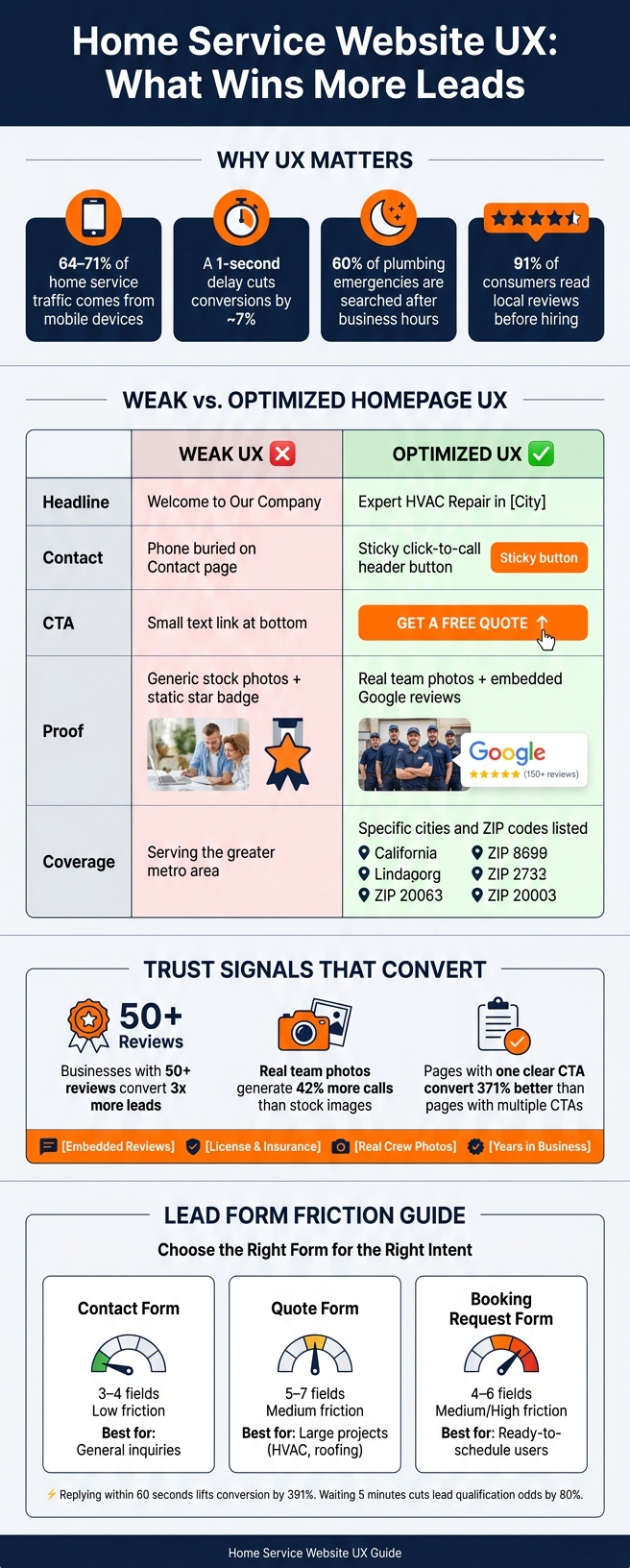
Home Service Website UX: Weak vs. Optimized - Key Stats & Best Practices
| Area | What users need | What your site should show |
|---|---|---|
| Homepage | Fast answers | Service, city, phone number, main CTA |
| Urgent intent | Immediate contact | Sticky call button, after-hours note, fast load time |
| Planned intent | Proof before contact | Project photos, reviews, process, financing |
| Routine intent | Convenience | Online scheduling, offers, FAQ, price range |
| Service pages | Job-specific details | Problem, fix, steps, proof, focused CTA |
| Local pages | Area confirmation | City names, ZIP codes, map, local reviews |
| Mobile UX | Low friction | Tap-to-call, large buttons, short menu |
| Forms | Fast completion | Name, phone, short message |
| Trust near CTA | Lower hesitation | Reviews, license info, insurance, team photos |
| Lead tracking | Clear source data | Call tracking, form tracking, CTA tracking |
A home service site does not need fancy design. It needs to help homeowners act fast, with less doubt and fewer steps.
Now that the page types are set, the homepage needs to do one job well: send visitors to the right next step. You have about five seconds to answer three basic questions:
If those answers aren't easy to spot, people bounce.
Above the fold should answer the first question fast. Use a plain-language headline that includes the service and your main city. Then add a short service-area line with nearby cities or ZIP codes.
For example, "Expert HVAC Repair & Installation in Denver" says far more than "Quality You Can Trust." One tells people what you offer. The other sounds nice, but it doesn't help much.
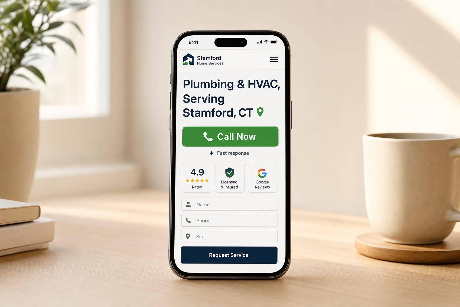
Your phone number should sit in the header. On mobile, make it a sticky click-to-call button that's at least 44×44 pixels. Pair that with one clear primary CTA in the hero, such as "Request a Quote", "Schedule an Estimate," or "24/7 Emergency Service" if your trade gets urgent calls.
Once the hero is clear, the rest of the homepage should cut doubt and guide people toward contact.
Below the hero, add proof that lowers risk and nudges visitors to call or fill out a form.
Use clickable service cards that lead to each service page. Show real photos of your team and branded trucks instead of stock images. Sites that use real images get 42% more calls than sites that lean on stock photos.
Google reviews also need to feel real. Embed reviews with names and dates instead of showing a generic 5-star badge. 91% of consumers read local reviews before hiring.
Place your license, insurance status, and years in business near the CTA or form. A line like "Licensed & Insured · Serving Phoenix Since 2009" beside a "Request a Quote" button can ease hesitation and push more people to contact you.
If your trade deals with after-hours emergencies, add a visible "24/7 Available" note near the top. That matters, especially when 60% of plumbing emergencies are searched for after business hours.
| Feature | Weak Homepage UX | Optimized Contractor Homepage UX |
|---|---|---|
| Headline | "Welcome to Our Company" | "Expert HVAC Repair & Installation in [City]" |
| Contact Access | Phone number buried on Contact page | Sticky header with click-to-call button |
| CTA | Small text link at the bottom | High-contrast "Request a Quote" button above the fold |
| Proof | Generic stock photos; static 5-star graphic | Real team photos; embedded Google reviews with names and dates |
| Coverage | Vague "Serving the greater metro area" | Specific list of cities and ZIP codes served |
Once the homepage points people in the right direction, service pages and local pages handle the next two decisions: what job do you need done and do we work in your area?
A service page should do one job well: help a visitor understand a single service and push them toward one quote request. Service pages explain the work itself. Local pages, on the other hand, prove area coverage and build neighborhood-level trust.
Start with the customer's problem, not your company story. If someone lands on a fence repair page, they want to know if you can fix a leaning fence, how the job works, how long it may take, and what happens next. That should come first.
Walk through the solution in plain English. Show the process step by step. Then back it up with proof: before-and-after photos from past jobs and reviews that mention that exact service.
Pricing matters too. 62% of customers expect to see at least a price range or "starting at" figure online. When you hide pricing completely, people hesitate. Even a starting point can reduce friction and help visitors decide if it's worth reaching out.
Your call to action should match the service on the page. So instead of a broad "Contact Us", use something direct like "Request a Fence Installation Quote." That kind of focus works. Pages with one clear CTA convert 371% better than pages with several competing choices.
A local page has one main task: answer do you serve my area? It should do that fast.
Your H1 and title tag should follow the format "[Service] in [City, State]" so the page lines up with that search intent right away.
But don't stop at dropping in the city name. Add details that sound like they came from someone who knows the area. Mention neighborhoods, local landmarks, and common area issues like hard water or old plumbing. Show an embedded Google Map with your service boundaries. List the ZIP codes you cover. Use photos from jobs you've done in that city, not stock images that could be from anywhere.
Local reviews help here too. Include reviews from that area with names, dates, and service details. That kind of proof helps people feel more at ease before they call.
These pages also help screen leads before a form ever gets submitted. Local pages improve lead quality by filtering out visitors who are outside your service area. Fewer bad-fit calls. More talks with people you can actually help.
These pages only do their job, though, if mobile visitors can get to the CTA without friction.
| Feature | Service Page UX | Local Page UX |
|---|---|---|
| Content Focus | Problem, solution, process, and pricing | Coverage area, neighborhoods, and local trust |
| Search Intent | "How to fix [problem]" or "[service] cost" | "[Service] in [City]" or "[service] near me" |
| Trust Cues | Before/after photos, certifications, service-specific reviews | Service area map, ZIP codes, local project gallery |
| CTA Style | Service-specific (e.g., "Request a Fence Quote") | Location-specific (e.g., "Schedule Service in [City]") |
| Internal Links | Links to relevant local/city pages | Links to core service pages |
| Ideal Supporting Elements | Pricing ranges, process steps, service FAQ | Neighborhood mentions, local landmarks, embedded map |
Once your page makes it clear what you do, the next job is simple: make it easy for homeowners to contact you. This matters most on mobile. In home services, people often search from their phones while dealing with a leak, no AC, a broken garage door, or some other headache. If the mobile experience feels clunky, they’ll bounce fast.
A sticky click-to-call button is one of the most important mobile features on a contractor website. Keep the phone number or a Call Now CTA visible in the mobile header as users scroll. Then use href="tel:..." links so one tap starts the call right away.
Navigation should stay short and simple. A long menu adds extra choices, and extra choices slow people down. Make buttons at least 44×44 pixels so they’re easy to tap with a thumb. Page speed matters too. Keep pages under 2 seconds by compressing images and removing scripts you don’t need. If you offer urgent service, use an emergency CTA only on those urgent-service pages.
Once someone taps into a form, the goal is to remove the next hurdle. Short forms tend to convert better. Each extra field cuts submissions by about 4%. For most home service sites, the form should ask for only the basics:
That’s often enough to start the conversation. After submission, show a short success message and tell the visitor when they should expect a reply.
Speed matters just as much after the form comes in. Replying to a website inquiry within 60 seconds can lift conversion by 391%, while waiting only 5 minutes can cut the odds of qualifying that lead by 80%. In home services, speed to lead isn’t just a sales issue. It’s part of the user experience.
| Form Type | Field Count | Visitor Intent | Friction Level | Best Use Case |
|---|---|---|---|---|
| Contact Form | 3–4 fields | General inquiry | Low | Basic questions or non-urgent service requests |
| Quote Form | 5–7 fields | High - price shopping | Medium | Larger projects needing a cost estimate, such as water heater replacement, roofing, or HVAC replacement |
| Booking Request Form | 4–6 fields | Ready to book | Medium/High | Users ready to schedule a specific time slot; often includes a time-slot picker |
Once your CTA is clear, the next thing that tips the decision is trust. This is where a lot of contractor sites fall flat. They add vague badges or generic claims, but they don’t answer the quiet question running through a homeowner’s mind: Can I trust these people with my home?
Put specific trust signals right beside every CTA or form. That means embedded reviews, license and insurance details, and real crew photos. Not stock photography. Not vague “top-rated” labels. Actual proof.
The data backs this up. Businesses with 50+ reviews convert 3x more leads than those without. And websites that use real team photos get 42% more calls than sites using stock images. Small details like these can remove the doubt that keeps someone from reaching out.
Once trust is in place, you need to track what’s producing leads. Traffic numbers alone don’t tell you much. A page can get visits all day and still do nothing for your business.
Track these four events across the whole site:
Call tracking matters most for many contractors because phone calls often turn into jobs. Professional call tracking software usually costs between $45 and $75 per month. In return, it can show which traffic source, keyword, or page brought in the call.
That level of detail matters because calls convert at 46%, and 37% close on the first call. If you’re not tracking calls at the source level, you’re flying blind.
After the main UX fixes are live, watch what changes move lead flow the most. A high-converting contractor website isn't about looking fancy. It's about removing friction between a homeowner's problem and your phone ringing, which is the standard Estatehub builds toward on every client site it touches.
Start on the homepage. Make your service, location, and phone number impossible to miss above the fold. Then tighten up your service pages and local pages so people can tell, fast, that you serve their area and handle the job they need.
On mobile, keep the call path one tap away. Keep forms short. Put trust signals, like real reviews, credentials, and real team photos, next to every decision point. Then track every action that matters so you can see what's pulling in leads and what's getting ignored.
Start with the mobile-first, above-the-fold basics that help turn visitors into leads.
Your homepage should load in under 3 seconds. It should also include a clickable “Call Now” button in the header, so people on their phones can reach you right away.
Above the fold, your page needs to explain the big stuff fast:
That way, someone landing on your site doesn’t have to hunt around or guess. They should get the point almost instantly.
Navigation matters too. Keep it simple so people can find key information in about 15 seconds. If your menu feels cluttered or sends visitors in circles, that’s a problem.
And near your lead form, add real reviews or credentials. A little proof in the right spot can make a big difference when someone is deciding whether to contact you.
Keep contact forms short: three to six fields.
In many cases, three fields convert best, such as:
Why keep it short? Because every extra field can cut submissions by about 4% to 11%.
If you need more detail for complex services, use a multi-step form with progress indicators. It breaks the process into smaller parts, so the form feels less overwhelming.
Track conversions in Google Analytics, like form submissions, phone calls, and bookings, then check your conversion rate. For home services, 2%–5% is a solid benchmark.
It also helps to watch bounce rate, page load speed, and mobile conversions on their own if most of your traffic comes from smartphones or tablets. Add call tracking, plus recordings or heatmaps, to see where people click and where friction may be costing you leads.
Sign up for the newsletter and be the first to read our articles.


Every single person on our agency team has spent a lot of time in the field either running their own business or working for larger marketing agencies. We have all put in the time responding to leads, helping customers, scheduling and doing services. This gives us a massive advantage when making decisions.
One thing that has always been very special to us, is the fact that (excluding spam / people that never used our services) we do not have any bad reviews. This absolutely does not mean we have never had unhappy clients, but if it happens, we make it right, and stand behind our promises.
We have seen, time and time again, other agencies using strategies and structuring campaigns the way that they are technically supposed to. Most of these "best practices" that are taught in our industry, simply do not transfer into local lead gen. This is partially because we do have a much different target audience, and are typically spending less, however optimizing for website traffic does not work here.
We have been there, jumping into starting a home service business, struggling, and doing everything wrong. It's humbling. Our team has all felt the highs and lows, which is why we get so excited for our clients to win, we know how good it feels.

Estatehub is not a normal agency, we know "clicks" don't get you sales. Let us show you how lead gen experts do it.

